Creating Custom Lists with Navigation Drawers | Vuetify To-Do List App Tutorial
Enable users to create custom lists and select them from a navigation drawer in the app

Welcome back to another episode in this insightful tutorial series. We’ve been building a great-looking to-do list app for the past few days, and we’ve made a lot of progress with it. We’ve learned quite a lot about Vuetify JS, the popular Material Design Framework we’ve been using to design our app. In our last episode, we were able to use certain Vuetify components to create tabs for grouping our tasks. Today, we’re going to add features for further sorting our tasks, using user-defined lists.
Just getting started with Vuetify? Check out this article.
Creating Navigation Drawers with Vuetify
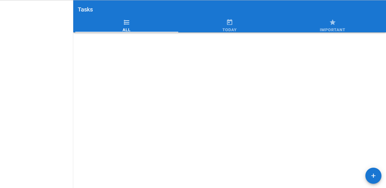
We begin creating an empty navigation drawer with the v-navigation-drawer component from Vuetify. Setting the app prop signifies to Vuetify that the drawer is part of the application layout and dynamically adjusts the content sizing of the v-main component to accommodate the navigation drawer.
src/App.js<template>
  <v-app>
    <v-card>
      <v-app-bar color="primary" elevation="3" dark rounded="0" app>
        <v-toolbar-title>Tasks</v-toolbar-title>
        <template v-slot:extension>
          <v-tabs v-model="tab" fixed-tabs icons-and-text>
            <v-tabs-slider color="white"></v-tabs-slider>
            <v-tab>
              All
              <v-icon> mdi-format-list-checkbox </v-icon>
            </v-tab>
            <v-tab>
              Today
              <v-icon> mdi-calendar-today </v-icon>
            </v-tab>
            <v-tab>
              Important
              <v-icon> mdi-star </v-icon>
            </v-tab>
          </v-tabs>
        </template>
      </v-app-bar>
    </v-card>
    <v-navigation-drawer app> </v-navigation-drawer>
    <v-main>
      <v-tabs-items v-model="tab">
        ...
      </v-tabs-items>
    </v-main>
Adding a Navigation Drawer Title
We’ll display a title on the navigation drawer with the v-toolbar component. As you’ll recall, we once used this component to create the toolbar for our app in our very first episode in this series.
src/App.js<template>
  <v-app>
    ...
    <v-navigation-drawer app>
      <v-toolbar flat
        ><v-toolbar-title>Coding Beauty To-Do</v-toolbar-title></v-toolbar
      >
      <v-divider></v-divider>
    </v-navigation-drawer>
    ...

Showing a Default List
For now let’s display a default list, which we’ll name “Misc” (for miscellaneous items). We’ll use the v-list component we first used when we were creating the list of tasks. Setting the nav prop on the v-list reduces the width of the v-list-item components contained in it.
src/App.js<template>
  <v-app>
    ...
    <v-navigation-drawer app>
      <v-toolbar flat
        ><v-toolbar-title>Coding Beauty To-Do</v-toolbar-title></v-toolbar
      >
      <v-divider></v-divider>
      <v-list dense nav>
        <v-list-item link>
          <v-list-item-icon
            ><v-icon>mdi-format-list-checkbox</v-icon></v-list-item-icon
          >
          <v-list-item-title>Misc</v-list-item-title>
        </v-list-item>
      </v-list>
    </v-navigation-drawer>
    ...
All the custom lists added by the user will be shown in this way:

Get the Full Source Code for This App
Sign up here to receive the latest source code for this great app!
Adding a Button to Create a New List
To allow the user to start creating new lists, we are going to add a button on the navigation drawer. We’ll place the button at the bottom of the drawer by putting it in append slot of the v-navigation-drawer component:
src/App.js<template>
  <v-app>
    ...
    <v-navigation-drawer app>
      <v-toolbar flat
        ><v-toolbar-title>Coding Beauty To-Do</v-toolbar-title></v-toolbar
      >
      <v-divider></v-divider>
      <v-list dense nav>
        <v-list-item link>
          <v-list-item-icon
            ><v-icon>mdi-format-list-checkbox</v-icon></v-list-item-icon
          >
          <v-list-item-title>Misc</v-list-item-title>
        </v-list-item>
      </v-list>
      <template v-slot:append>
        <div class="pa-2">
          <v-btn style="width: 100%" plain>
            <v-icon>mdi-plus</v-icon>
            New list
          </v-btn>
        </div>
      </template>
    </v-navigation-drawer>
    ...

Displaying a Dialog for Adding New Lists
We’ll display a dialog meant to get input for adding a new task, and we’ll do this with a new custom component, new-list-dialog. You’ll see the details of how this component is created when you open up the source code for the app.
src/App.js<template>
  <v-app>
    ...
    <v-navigation-drawer app>
      ...
    </v-navigation-drawer>
    <v-main>
      ...
    </v-main>
    <v-btn
      fab
      fixed
      right
      bottom
      color="primary"
      @click="showNewTaskDialog = true"
    >
      <v-icon>mdi-plus</v-icon>
    </v-btn>
    <new-task-dialog v-model="showNewTaskDialog" v-on:add-task="addNewTask" />
    <new-list-dialog v-model="showNewListDialog" />
  </v-app>
</template><script>
import { v4 } from 'uuid';
import taskList from './components/task-list.vue';
import NewTaskDialog from './components/new-task-dialog.vue';
import NewListDialog from './components/new-list-dialog.vue';export default {
  components: { taskList, NewTaskDialog, NewListDialog },
  name: 'App',
  data: () => ({
    tasks: [],
    showNewTaskDialog: false,
    showNewListDialog: false,
    tab: null,
  }),
  ...
};
</script>
...
If you’ve been following along in previous tutorials, you’ll also notice that the dialog we created earlier for adding new tasks has been refactored into a custom new-task-dialog component.

Displaying a New List in the Navigation Drawer
Let’s create a new list array to store our custom lists. We’ll update this array whenever the user successfully adds a new list with the new-list-dialog , and we’ll display all its elements in the navigation drawer with the v-for directive:
src/App.js<template>
  <v-app>
    ...
    <v-navigation-drawer app>
      ...
      <v-list dense nav>
        <v-list-item link v-for="(list, index) in lists" :key="index">
          <v-list-item-icon
            ><v-icon>mdi-format-list-checkbox</v-icon></v-list-item-icon
          >
          <v-list-item-title>{{ list }}</v-list-item-title>
        </v-list-item>
      </v-list>
      ...
    </v-navigation-drawer>
    ...
    <new-list-dialog v-model="showNewListDialog" v-on:add-list="addNewList" />
  </v-app>
</template><script>
...export default {
  ...
  data: () => ({
    tasks: [],
    showNewTaskDialog: false,
    showNewListDialog: false,
    tab: null,
    lists: ['Misc'],
  }),
  methods: {
    ...
    deleteTask(id) {
      this.tasks = this.tasks.filter((task) => task.id !== id);
    },
    addNewList(list) {
      this.lists.push(list);
    },
  },
  ...
};
</script>
...

Enabling Setting the List for a New Task
Now that we can add new custom lists to our app, let’s add input to the new task dialog to allow a user to specify the list in which a new task should be added. To do this, we’ll need to supply all the existing lists in the app to the dialog through a new listNames prop on the new-task-dialog:
src/App.js<template>
  <v-app>
    ...
    <new-task-dialog
      v-model="showNewTaskDialog"
      v-on:add-task="addNewTask"
      :listNames="lists"
    />
    ...
  </v-app>
</template>
...
We’ll create a dropdown list in the new task dialog with the v-select component from Vuetify. We’ll make it display all the list names by passing the listNames array to its items prop:
src/components/new-task-dialog.vue<template>
  <v-dialog v-model="showDialog" width="500">
    <v-card>
      ...
      <v-form
        class="mx-4 mt-4 pb-4"
        ref="form"
        @submit.prevent="handleSubmit"
        lazy-validation
      >
        ...
        <div class="d-flex">
          <v-menu
            v-model="showDatePicker"
            :close-on-content-click="false"
            transition="scale-transition"
            min-width="290"
            top
            offset-y
          >
            ...
          </v-menu>
          <v-select
            :items="listNames"
            v-model="newTask.list"
            class="ml-4"
            outlined
            prepend-icon="mdi-format-list-checkbox"
            placeholder="Misc"
          />
          <v-checkbox
            v-model="newTask.isImportant"
            class="ml-4"
            label="Important"
          ></v-checkbox>
        </div>
        ...
      </v-form>
    </v-card>
  </v-dialog>
</template><script>
export default {
  ...
  props: ['value', 'listNames'],
  data() {
    return {
      ...
      newTask: {
        title: '',
        note: '',
        date: '',
        isImportant: false,
        list: '',
      },
    };
  },
  methods: {
    ...
    handleSubmit() {
      if (this.$refs.form.validate()) {
        this.showDialog = false;
        this.$emit('add-task', {
          ...this.newTask,
          list: this.newTask.list || 'Misc',
        });
        this.$refs.form.reset();
      }
    },
  },
  ...
};
</script>

Displaying Tasks in Their Respective Lists
Finally, we’ll allow the user to check out all the tasks added to a particular list by selecting it in the navigation drawer. To make list items selectable, we’ll wrap the v-list-items that will be displayed for each list inside the v-list-item-group component:
<template>
  <v-app>
    ...
    <v-navigation-drawer app>
      ...
      <v-list dense nav>
        <v-list-item-group
          v-model="selectedListIndex"
          mandatory
          color="primary"
        >
          <v-list-item link v-for="(list, index) in lists" :key="index">
            <v-list-item-icon
              ><v-icon>mdi-format-list-checkbox</v-icon></v-list-item-icon
            >
            <v-list-item-title>{{ list }}</v-list-item-title>
          </v-list-item>
        </v-list-item-group>
      </v-list>
      ...
    </v-navigation-drawer>
    <v-main>
      <v-tabs-items v-model="tab">
        <v-tab-item>
          <task-list :list="tasksInList" v-on:delete="deleteTask"></task-list>
        </v-tab-item>
        <v-tab-item>
          <task-list :list="tasksDueToday" v-on:delete="deleteTask"></task-list>
        </v-tab-item>
        <v-tab-item>
          <task-list
            :list="importantTasks"
            v-on:delete="deleteTask"
          ></task-list>
        </v-tab-item>
      </v-tabs-items>
    </v-main>
    ...
  </v-app>
</template><script>
...
export default {
  ...
  data: () => ({
    tasks: [],
    showNewTaskDialog: false,
    showNewListDialog: false,
    tab: null,
    lists: ['Misc'],
    selectedListIndex: 0,
  }),
  ...
  computed: {
    tasksInList() {
      return this.tasks.filter(
        (task) => task.list === this.lists[this.selectedListIndex]
      );
    },
    tasksDueToday() {
      const todayISOString = new Date().toISOString().substr(0, 10);
      return this.tasksInList.filter((task) => task.date === todayISOString);
    },
    importantTasks() {
      return this.tasksInList.filter((task) => task.isImportant);
    },
  },
};
</script>
...
Now we can see all the tasks only belonging to a particular list in the app:

We’re Done!
And we have finally come to the end of this exciting tutorial series. Hopefully, you now have a much wider and more practical knowledge on how to use this amazing UI library with Vue JS. We’ve gone through quite a lot of components and classes offered by Vuetify. We’ve seen how much design work it makes unnecessary and the ease with which it allows you to create attractive-looking web apps, like this one.
Remember, you can always get the full source for this app by signing up here.
Sign up for our weekly newsletter to keep up to date with more great content from us!
